
Unfortunately, the most obvious way the recession presented itself was through the inadvertent display of antiquated signage. Leech-like, I suck the authenticity of earlier America from these markers. They are forgotten and disused, or simply showing their age like the wrinkled tattoo of a former Marine. Their seductive powers are transformed, not through any individual merit of course, but only in context with the perpetual march of strip-mall America in all its beige and brown and tan glory, uniform lighted proclamations of Old Navys and Borders and Home Depots standing like dispensable sentinels against the quick wash of consumer attention. What I mean is, these old signs still seduce. They have passion. But it sparks a lust not in keeping with their original design. They are the amputee that suddenly becomes a fetish object for a select group of perverts. They are the junk of ghettos, gentrified through the privileged lens of a largely disinterested passer-by. Myself.
Let's take a look.
1.) Bang Bang
.JPG)
I found this sign in Rawlins, WY, home of the most godawful Chinese food ever conceived in the mind of man. Rawlins consists of about one square mile of businesses, 60% of which are boarded up or simply left standing naked, surrounded by a poppy field of trailers, rusted propane tanks, and partially clothed scampering children. This is the row marker for a drive-in movie theater in town long since left vacant. Long live the Wild Wild West.
2.) American Owned
.JPG)
.JPG) The manager of the LaBella hotel in Rawlins is American and proud of it. Is this backlash against the predominance of India Indians in the hotel businesses of interstate America? I like to think so.
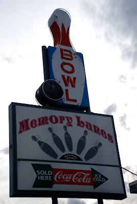
The manager of the LaBella hotel in Rawlins is American and proud of it. Is this backlash against the predominance of India Indians in the hotel businesses of interstate America? I like to think so.3.) Memory Lanes
.JPG)
Pulling into Rawlins, I was eager to head over to the bowling alley next to our hotel. As I found out however, Memory Lanes died a few years prior.
4.) Cold Pop
.JPG)
Hotel sign in Elko, Nevada. Three things I love about this sign. Number one, it says "pop," something I thought was dropped from the mass marketing lexicon around 1989. It brings back memories of front stoop sitting, cold glass bottle of Pepsi between chubby little kid legs still sore from little league. Number two, it is actually written on the glass. Permanence, by God! Advertising like a grumpy old man too proud to rest in the ground. Number three, check out that font! Also, the stylized "cold" really rocks my socks around.
5.) Truck Diesel
.JPG)
Where is truck diesel? I need some. Oh, red arrow! Thanks buddy!
6.) Washboard Laundry
.JPG)
Again, cursive font and block combo plus painted permanence = good good.
7.) Cup Cakes
.JPG)
The sign is not remarkable in and of itself. What I do enjoy however is the aesthetic effect of situating the signage in an extreme corner, letting it exist like a lone survivor of a plane crash, swimming in an ocean of sky. I see this tendency sweep the breadth and width of my photography these days. I love isolation. Awkwardness. Disjointed harmony. In this way I am not exceptional since the zeitgeist is all over this style these days.
8.) Boulder Co
.JPG)
Boulder Colorado in a nutshell.
Sorry to end on a cheap shot, but Boulder deserves it.
No comments:
Post a Comment